Edifício de apartamentos em Lugano
Angelo Bucci
Tatiana Ozzetti
Ciro Miguel
Eric Ennser
Giovanni M. de Faria
João Paulo M. de Faria
Juliana Braga
Nilton Suenaga
Fernanda Cavallaro
Joaquin Corvalan
Victor Próspero
BASERGA MOZZETTI ARCHITETTI
Nicola Baserga
Christian Mozzetti
Marilena Quadranti
Thea Delorenzi
ESTRUTURA
Ingegneri Pedrazzini Guidotti
[Andrea Pedrazzini,
Eugenio Pedrazzini,
Roberto Guidotti,
Karin Lehmann,
Ladislao Ricci]
CONSTRUÇÃO
Pedrazzini Construzioni
[Luigi Pedrazzini,
Alan Del Giorgio]
INSTALAÇÕES
Studio Tecnico Ferreti
[Idalgo Ferreti]
Crivelli
Aircond
ACR Energiebohr
ELÉTRICA
Elettronorma
[Daniele Ruess,
Daniele Baruffaldi]
Etavis [Mauro Marzini]
FÍSICA DA CONSTRUÇÃO
Physarch [Mirko Galli]
IMPERMEABILIZAÇÃO
Visetti Isolazioni
PROTEÇÃO CONTRA INCÊNDIOS
Studio Tecnico Geo Viviani
ILUMINAÇÃO
Ricardo Heder
Reka
Tulux
FACHADAS
Feroplan Engineering
[Marc Bischoff]
ÁREA DO TERRENO
992 m²
ÁREA CONSTRUÍDA
2661 m²
FOTOS
Nelson Kon
FORNECEDORES:
FACHADAS - VIDRO E METÁLICA
Generalmast
[Giuseppe Turati]
FACHADAS - MADEIRA
Bissig Gebr Holzbau GmbH
[Martin Bissig]
MARCENARIA
Veragouth [Oliver Moggi]
Cavaleri Mobili
[Peter Schrämmli]
SERRALHERIA
Officine Cameroni
[Paolo Tosi]
Symecom [Gianni Summo]
PISO
Granilite Tonella Loris
VIDROS
Glasvetia [Samuele Perone]
Introduction / acknowledgments
The accurate study previously done by Nicola Baserga and Christian Mozzetti, more than providing basic information about land use regulations in Lugano, gave us a reliable direction to our design concept. They provided us a good foundation for our proposal and due to their previous work, the project was already advanced before it even started.
Geometry
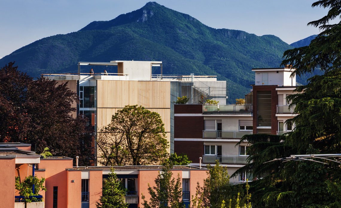
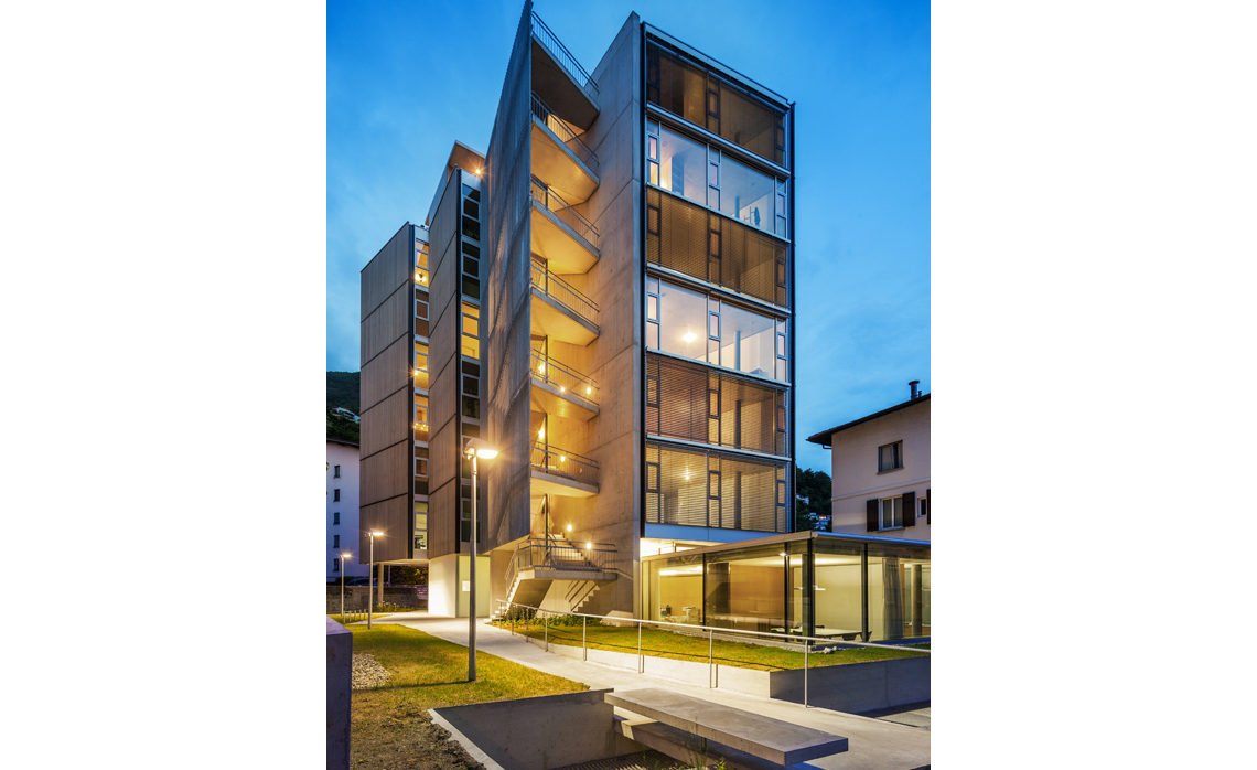
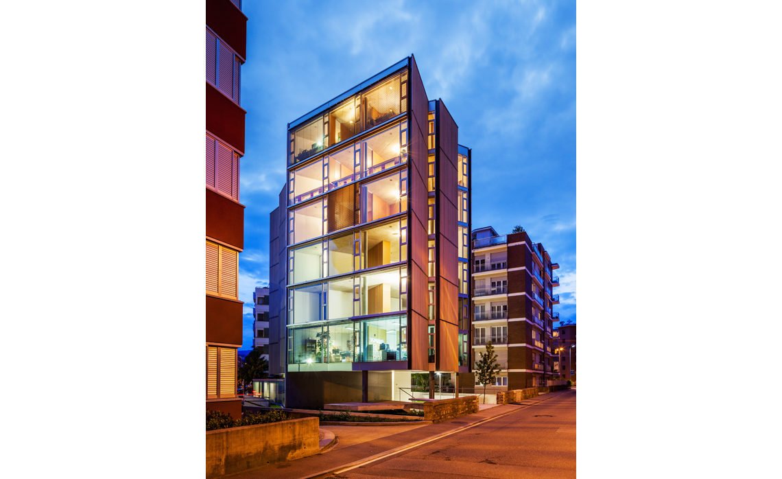
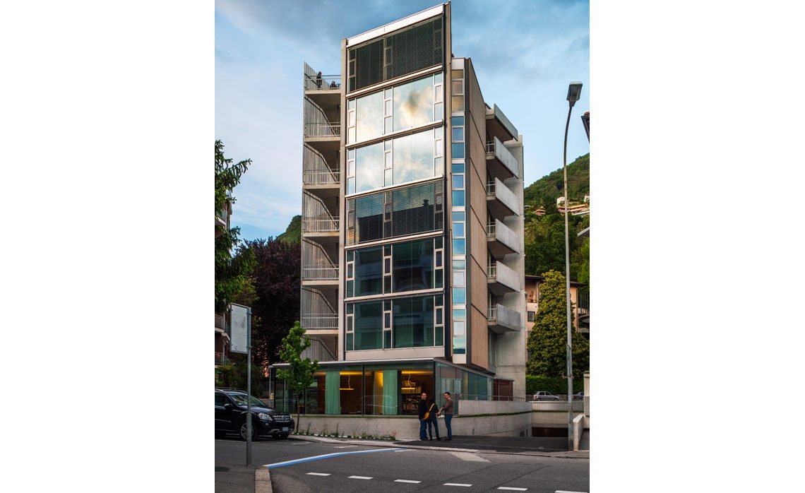
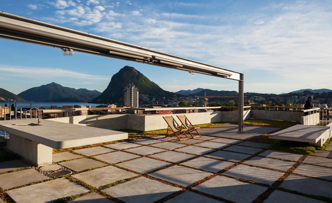
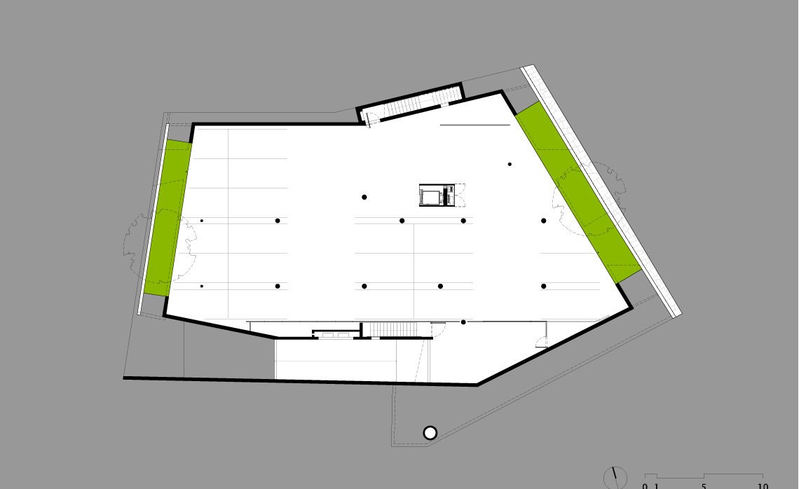
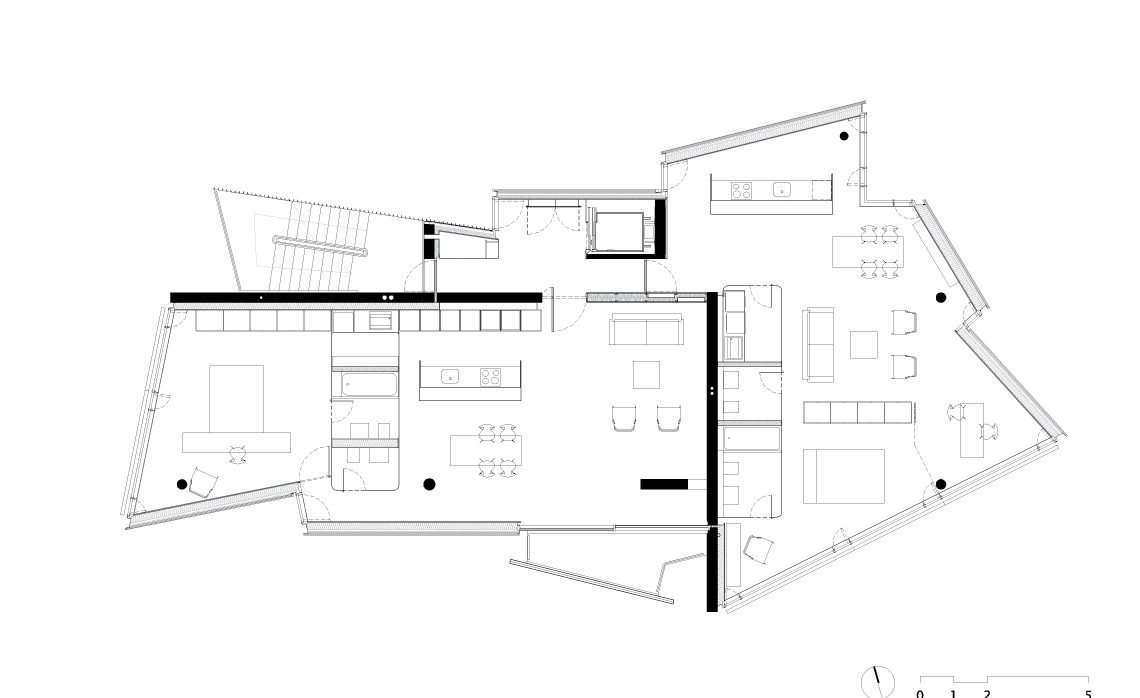
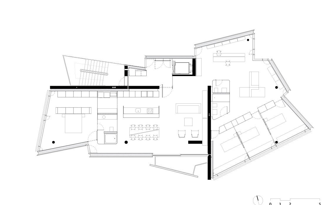
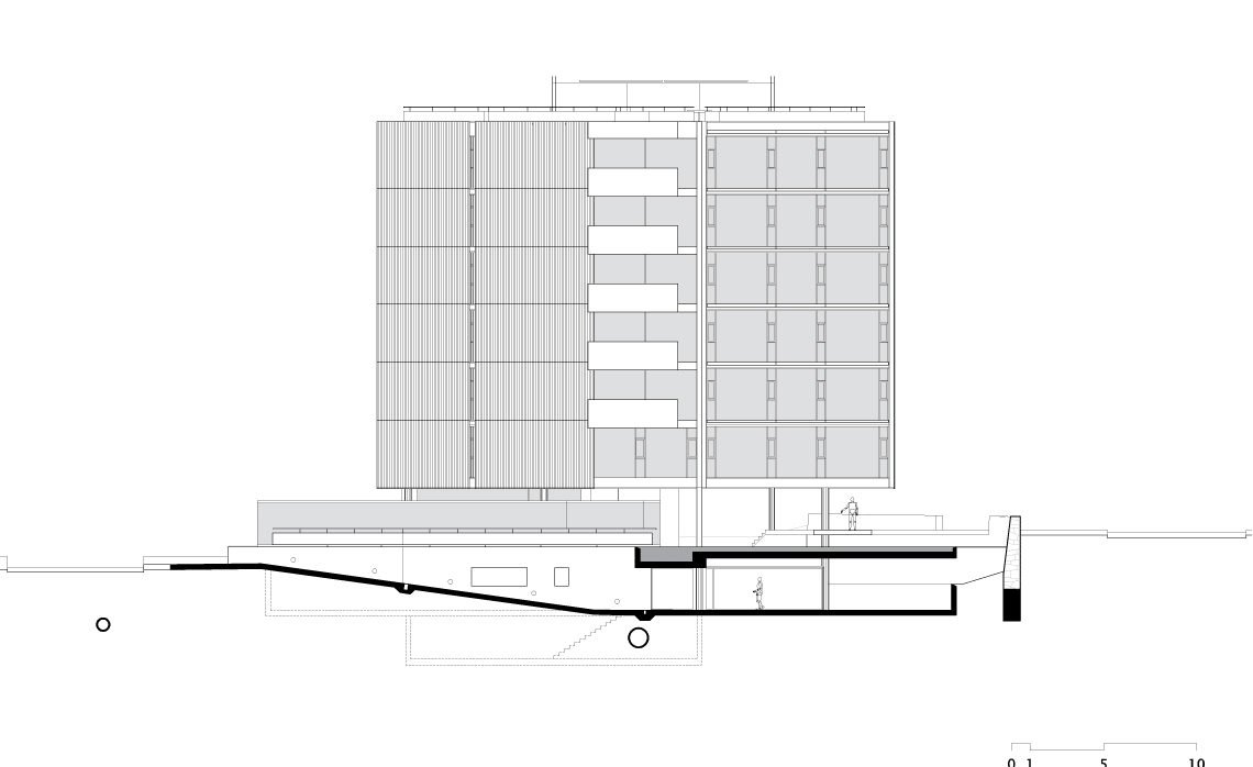
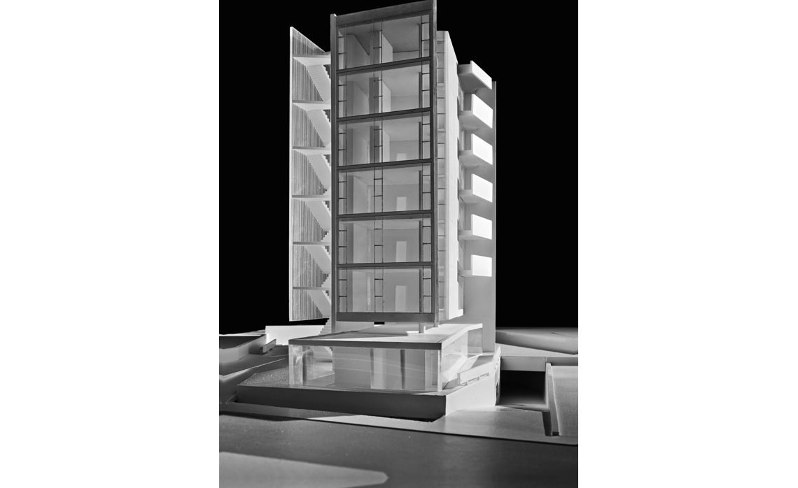
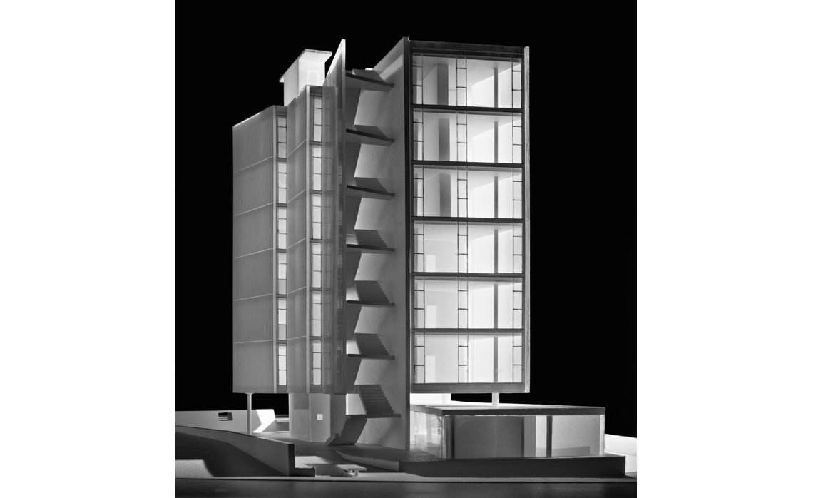
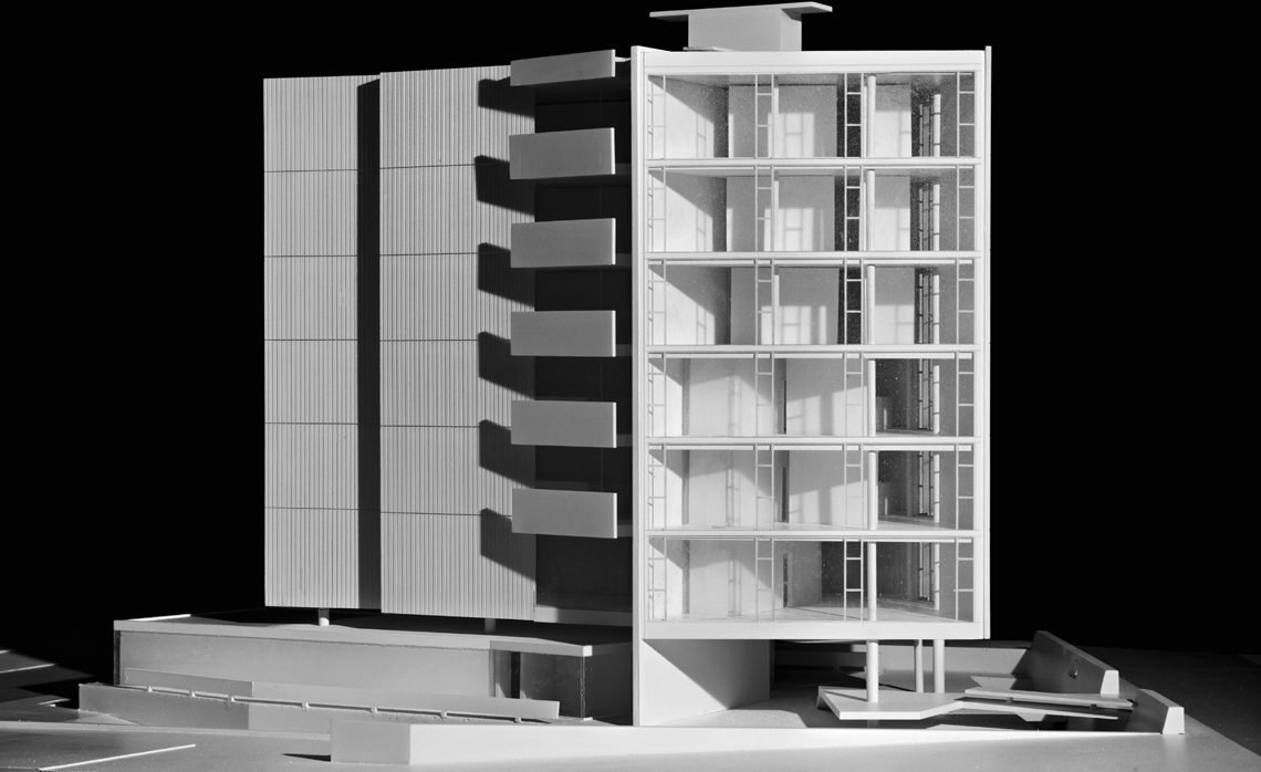
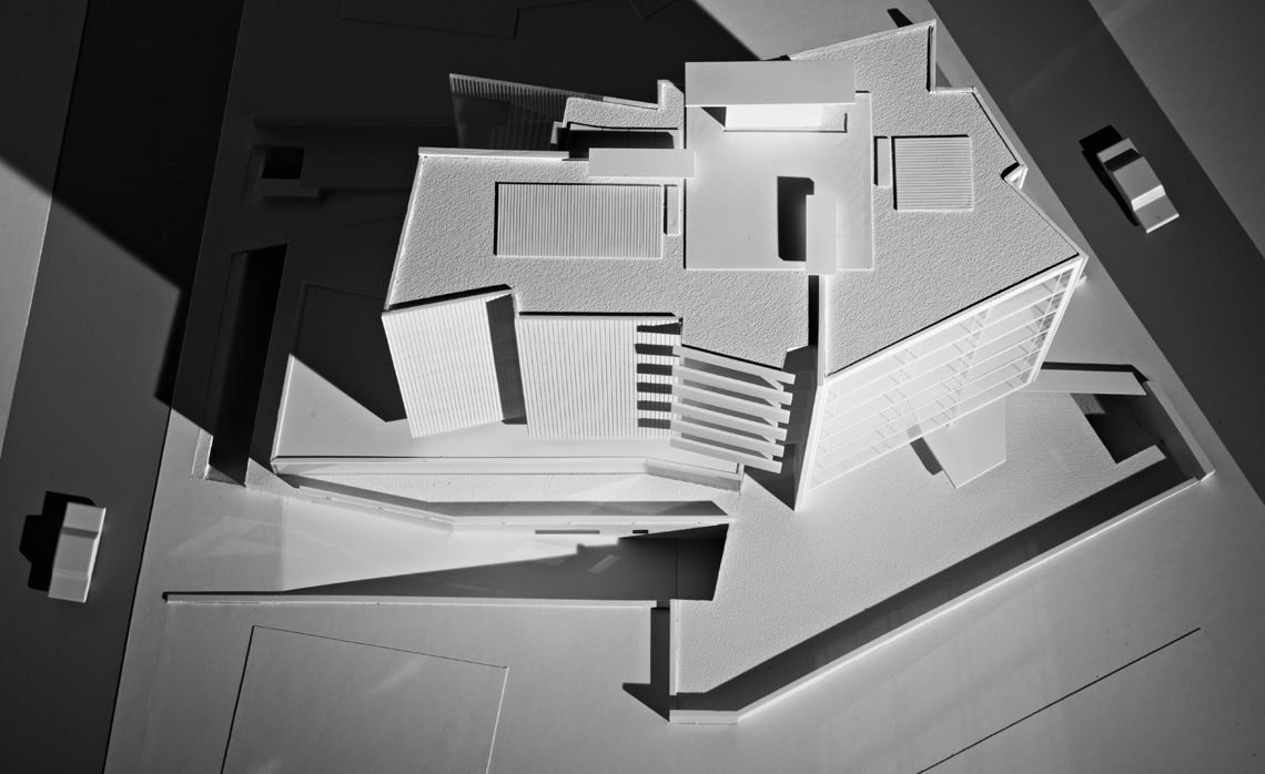
The irregular polygon which defines the site has seven sides and holds about 1,000 m2. The setbacks imprint an inner polygon (with a curve in one corner) that corresponds to a 330 m2 area in which it was possible to build 3 m above ground level. However, inside that inner figure we could only have 230 m2 per floor, considering the maximum height allowed (six floors) and the building program. The geometry of the slabs has two centers, as two cores of activities. On first three floors, it corresponds to one small apartment each, and for the three upper floors, it corresponds to two different programs in one large apartment.
Structure
The design of the structure follows those two cores.
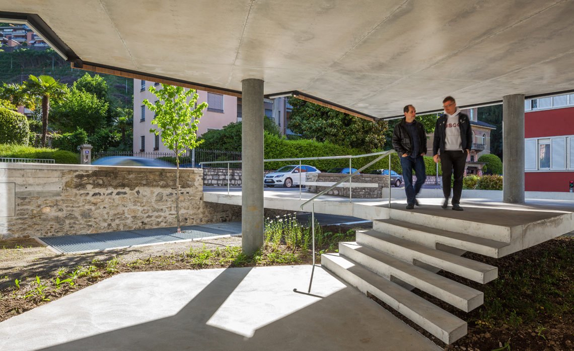
Each core is supported by a “T” concrete wall that supports vertical and horizontal loads. The “T” wall is associated to two columns for vertical loads. Both cores are structurally combined which their “T”s perpendicularly displayed in order to support horizontal efforts in both directions. A lonely extra thin column, placed on the extreme north, frees the slab geometry to configure areas where it wouldn’t be possible.
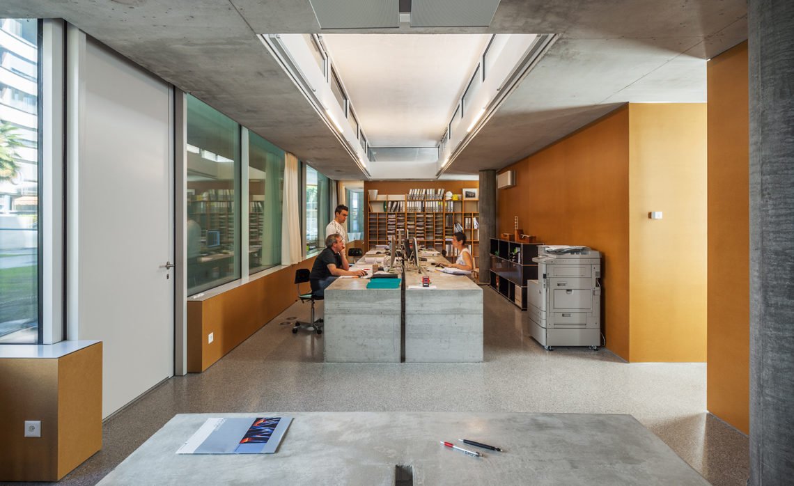
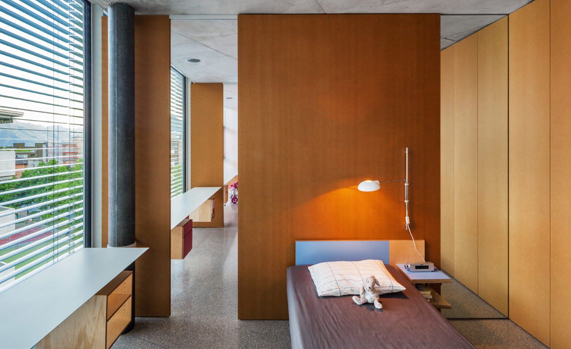
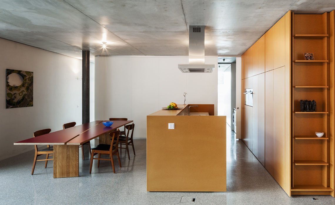
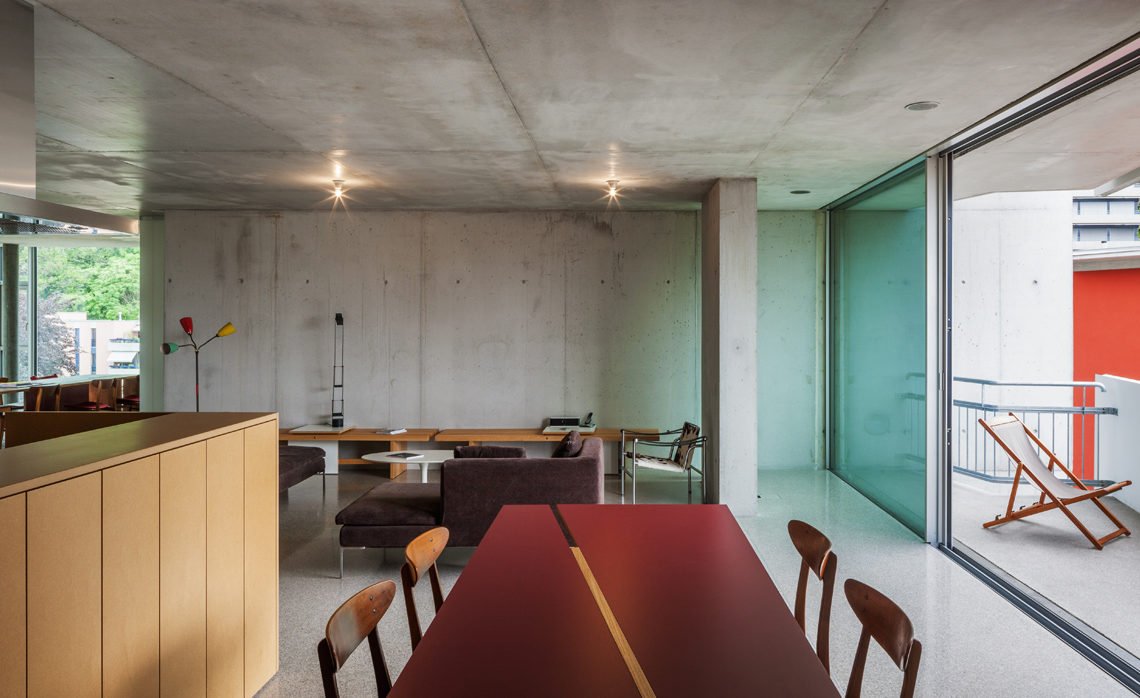
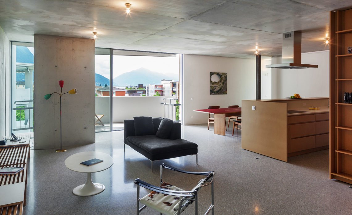
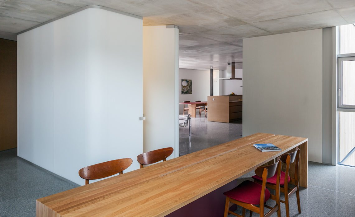
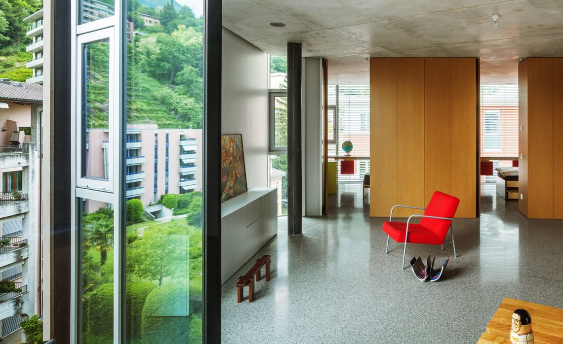
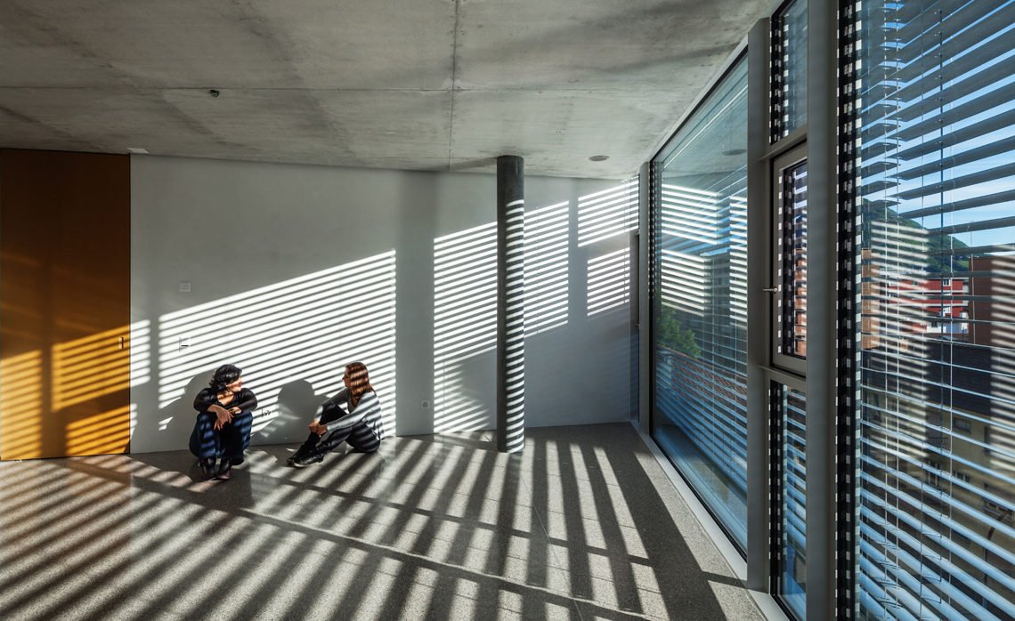
Such disposition of vertical elements waives the slabs of having beams. Therefore the slab plane has no clearly readable direction as usually happens with a structure with beams. As a result, once inside the building, the rigorous geometry of walls and columns cannot be easily understood. As if, once built, the building gives away its essence to be broken into parts, back to the surrounding geometry and the landscape.
Facades
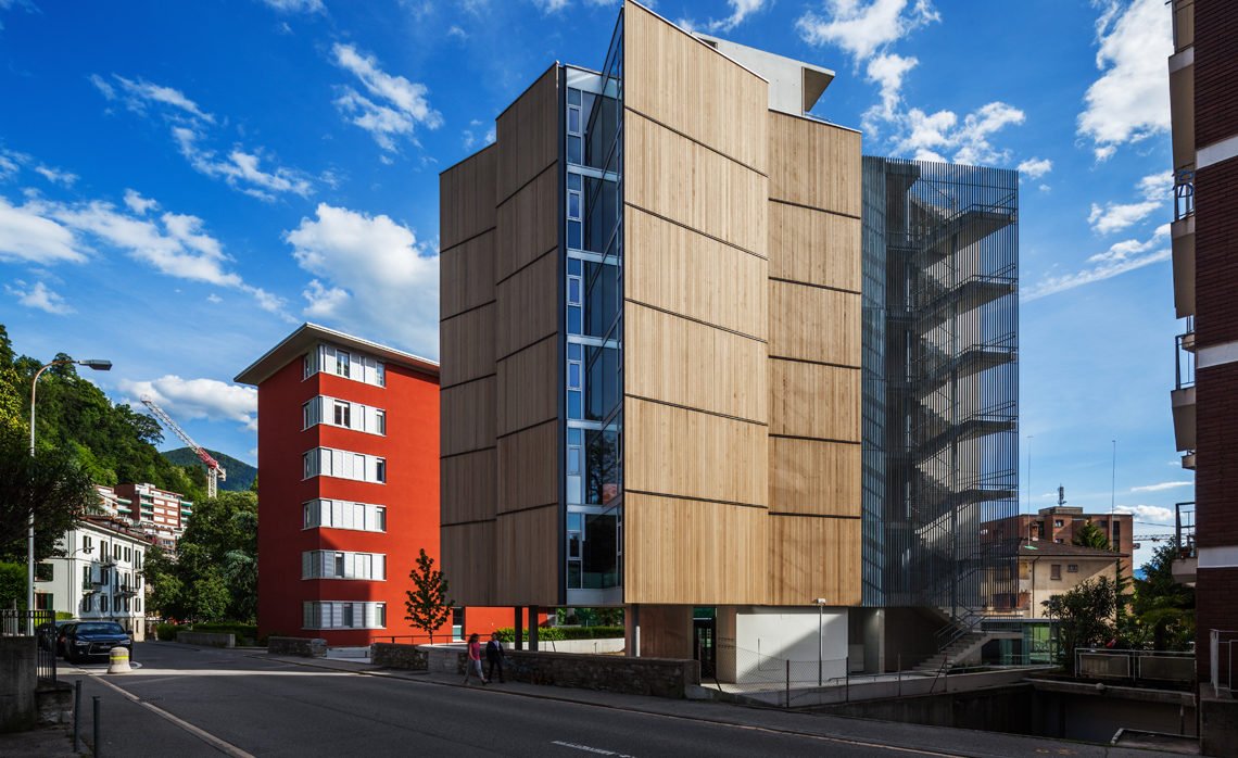
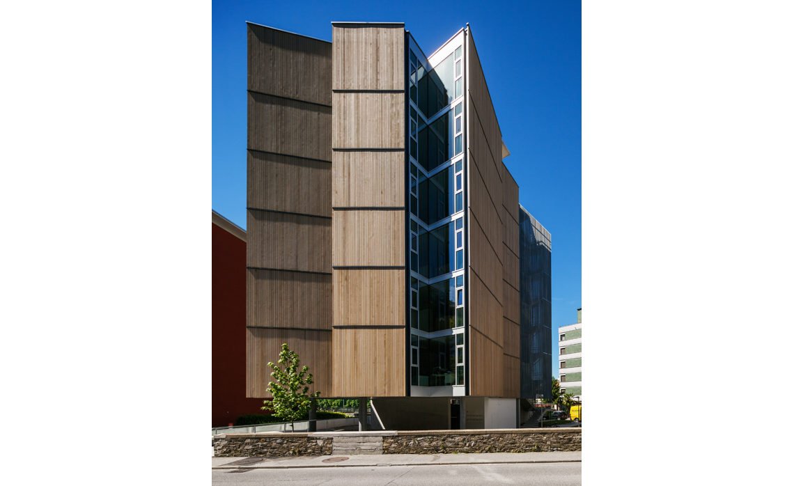
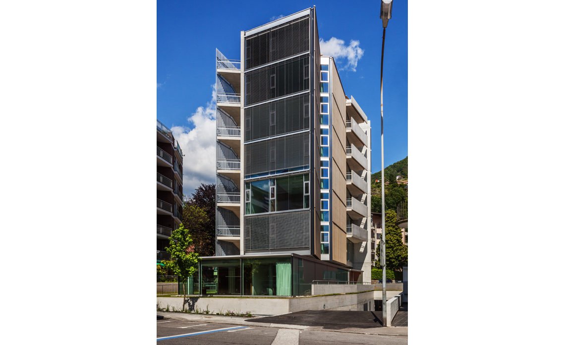
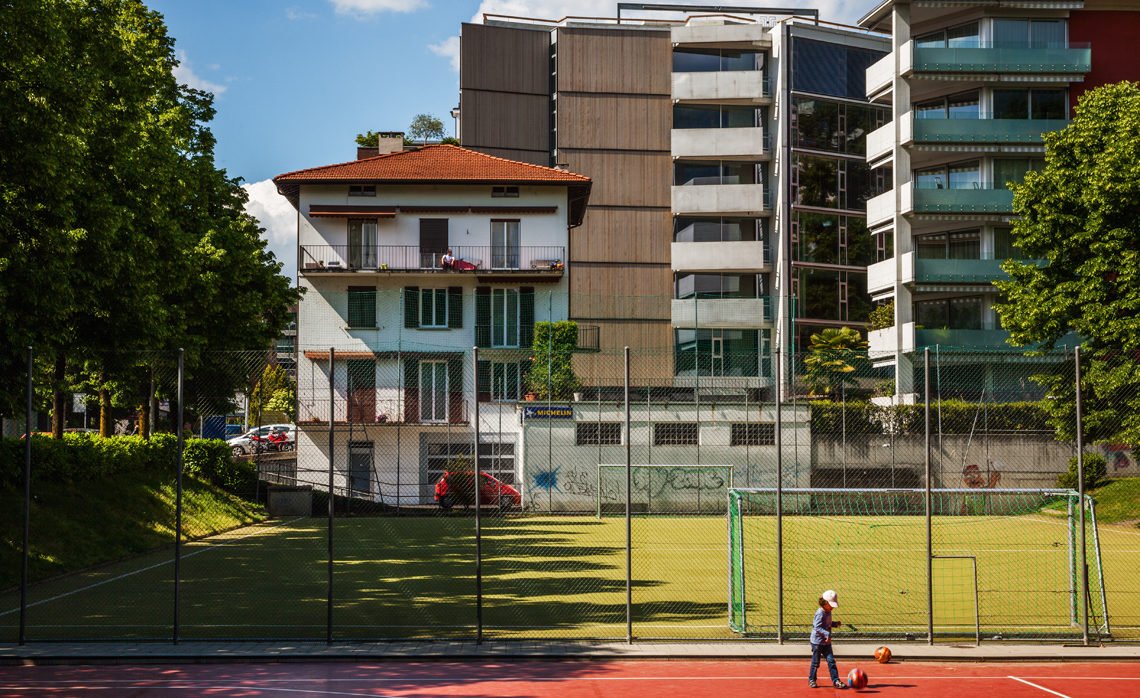
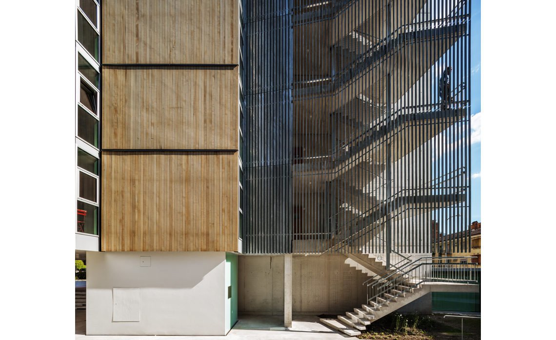
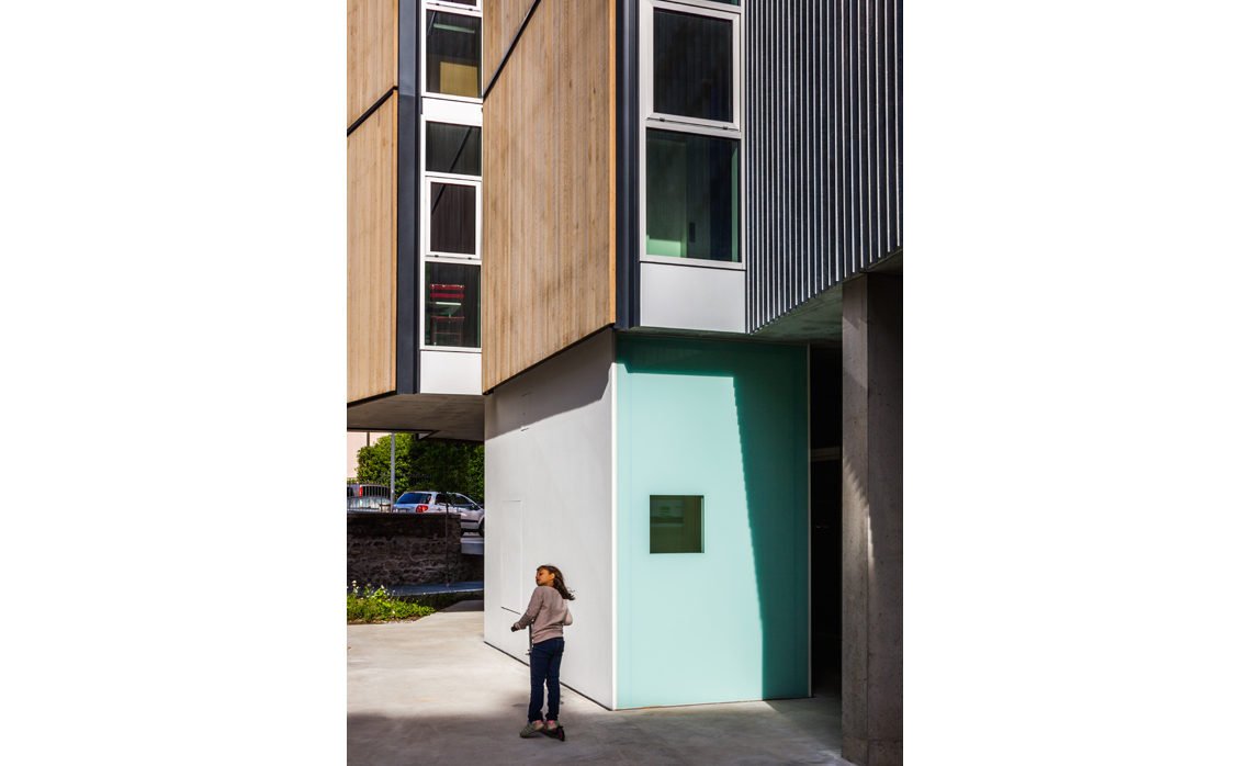
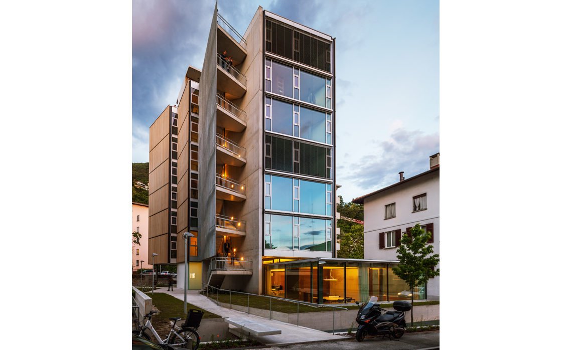
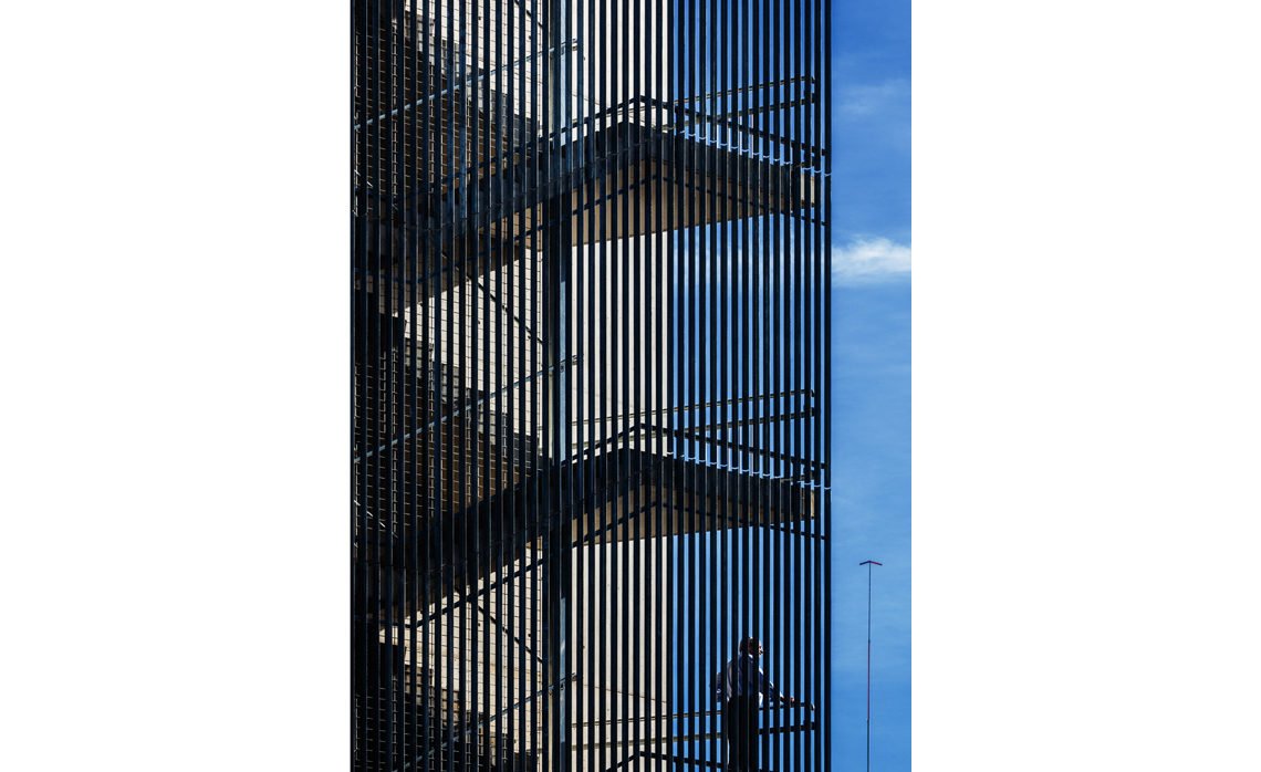
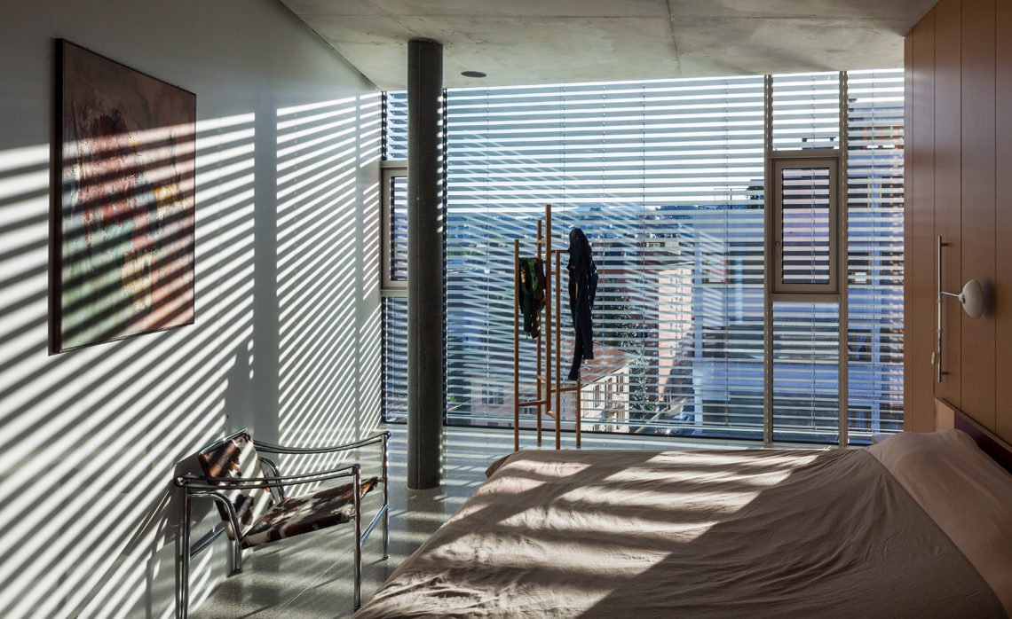
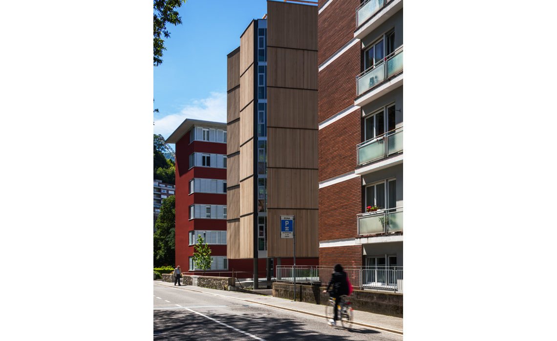
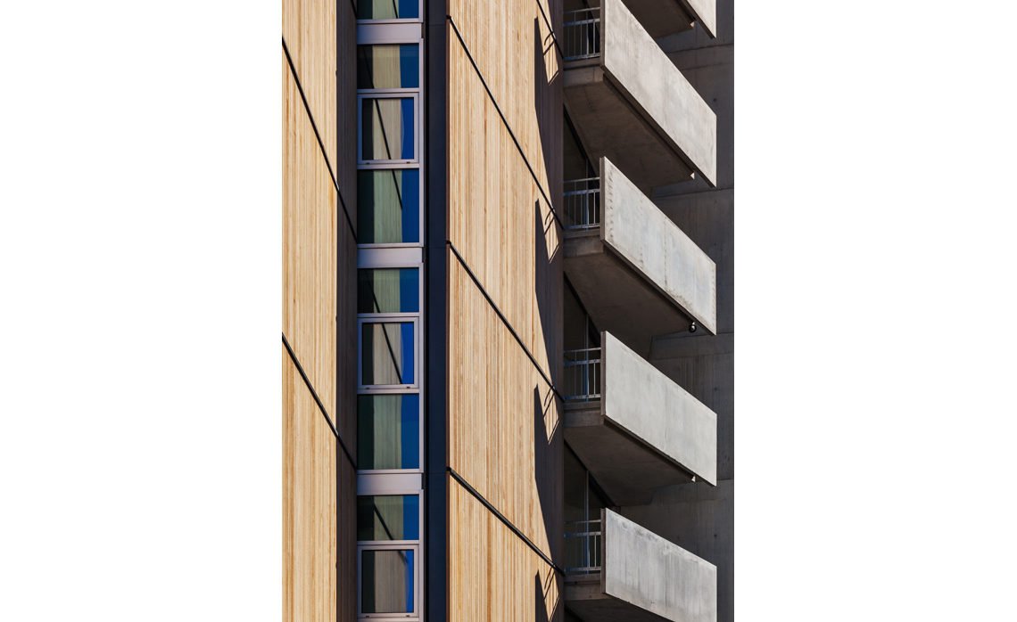
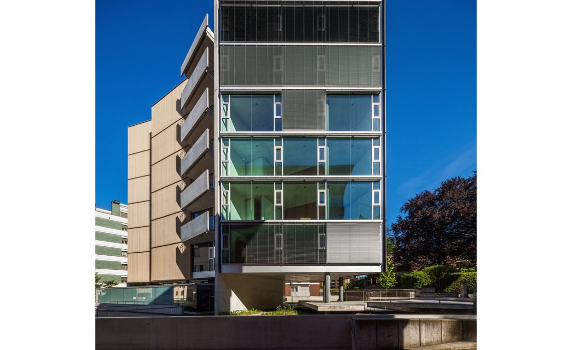
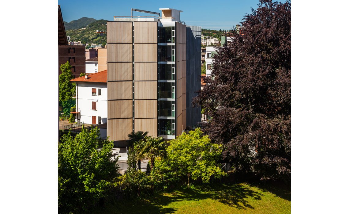
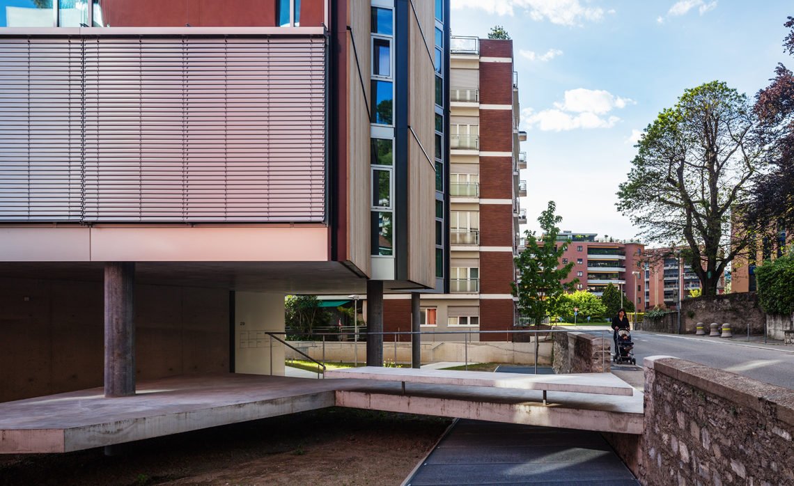
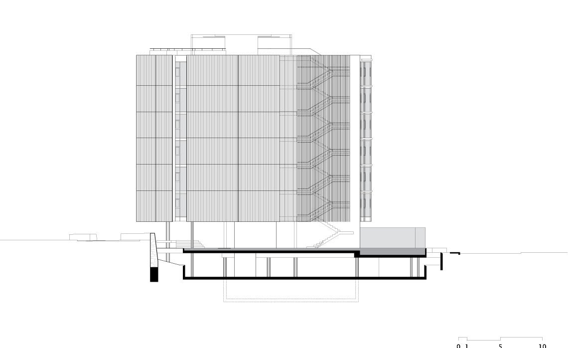
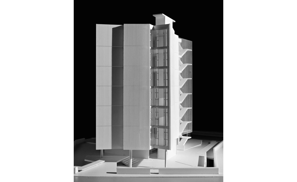
Each façade is either an opaque plane, made with wood panels, or a transparent one, made with glazing panels. The opaque plane always meets a transparent one. As a result, from inside, the view has always an escape to the outside. On the other hand, from outside, the building volume seems like not having solids, just by planes.
Ground level
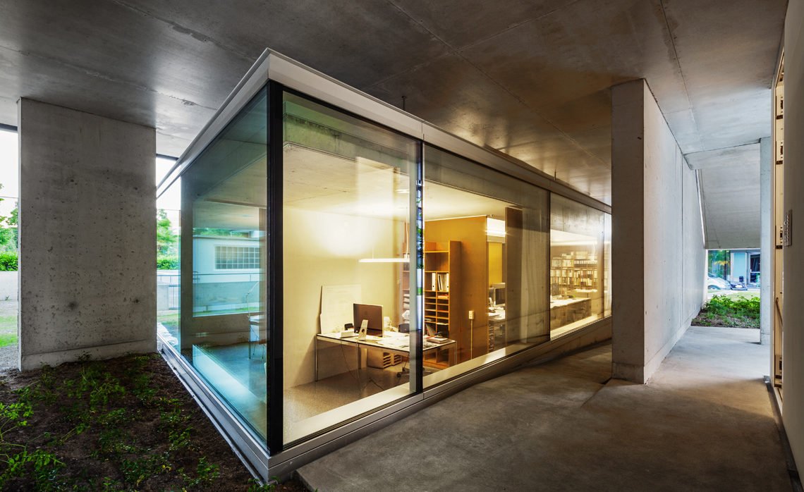
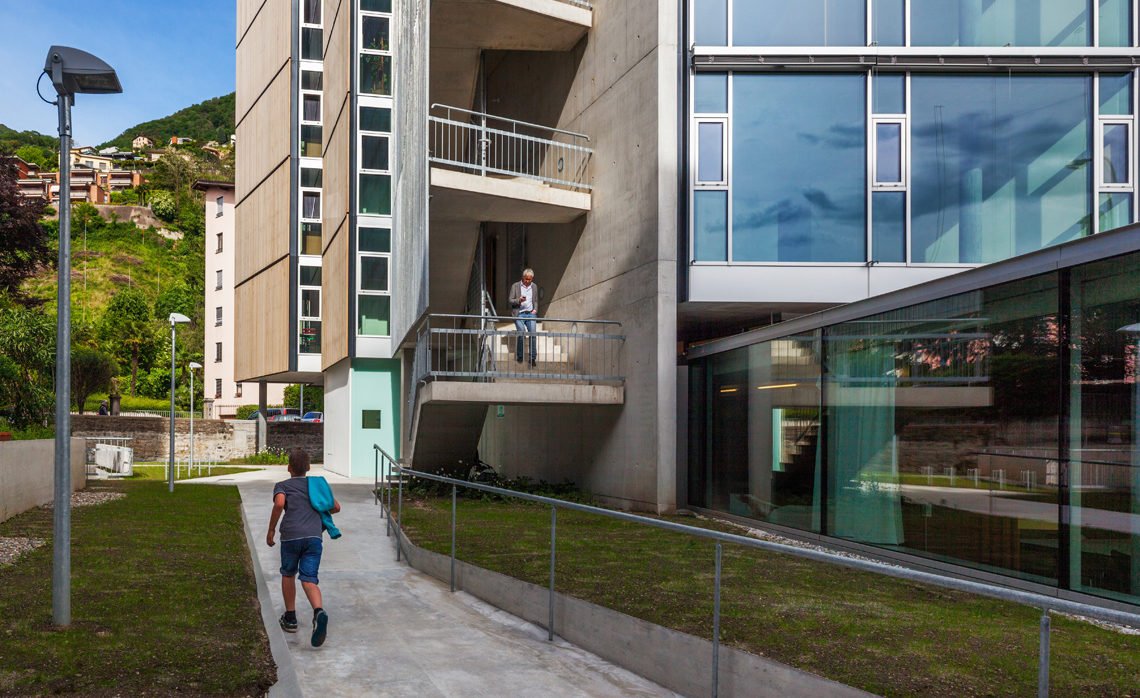
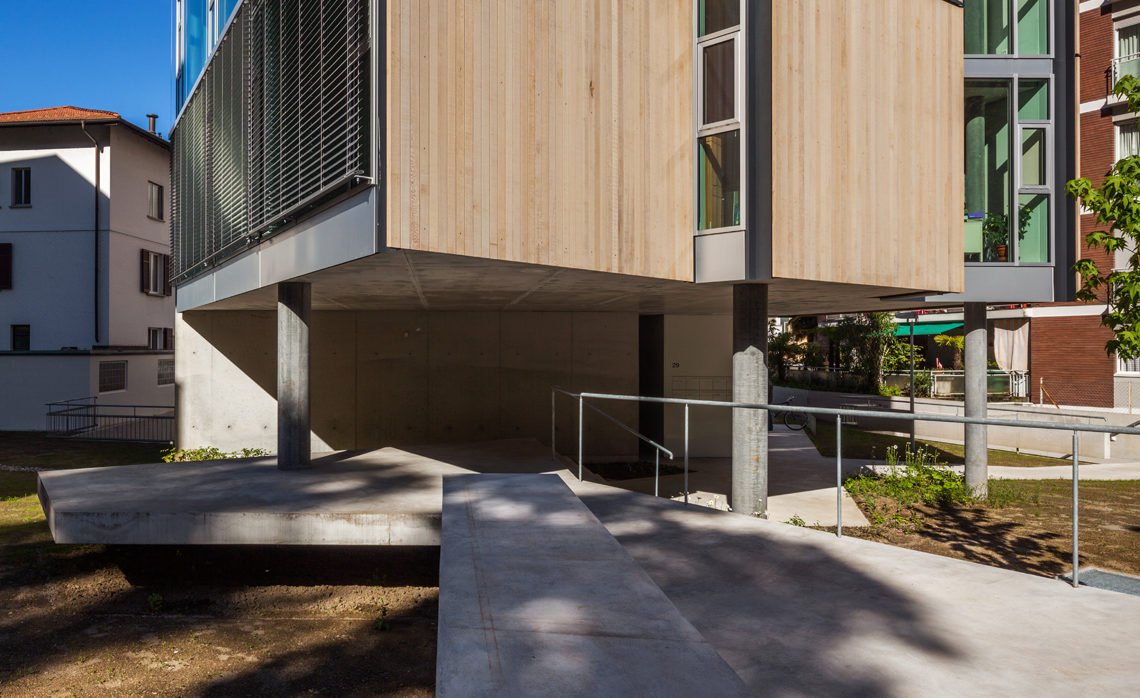
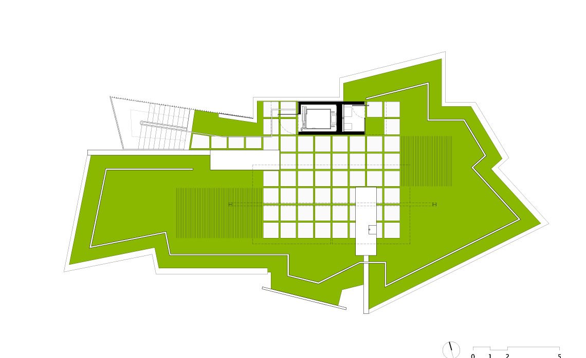
The ground level is an open passage. Specifically for those who have the building as a destination, the ground level shares two different programs: housing and office.
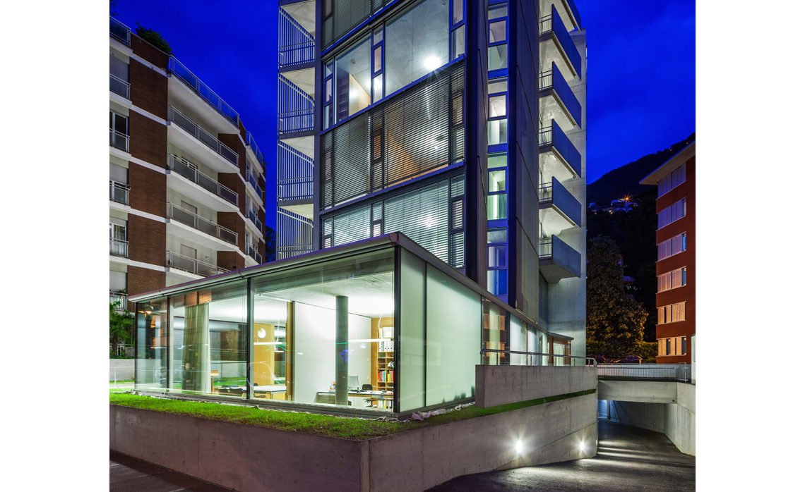
The office space is placed slightly sunk in the middle of the garden. As a result its height is shorter than that we typically associate to an inhabited construction and one cannot immediately realize its function. Besides, it was carefully placed aside the path and protected by the two structural reinforced concrete wall. As such, it merges two contrasting features: on the one hand it is quite discrete; on the other hand it brings some vitality to a peripheral corner of the site.
At this level, the housing program is just announced by a small abstract prism, the elevator hall, whose size and feature were carefully calibrated not predominate in that space.
Neither house nor office, the predominance on the ground level is an open space. Although surrounded by gardens, the ground here is completely constructed.
Underground level
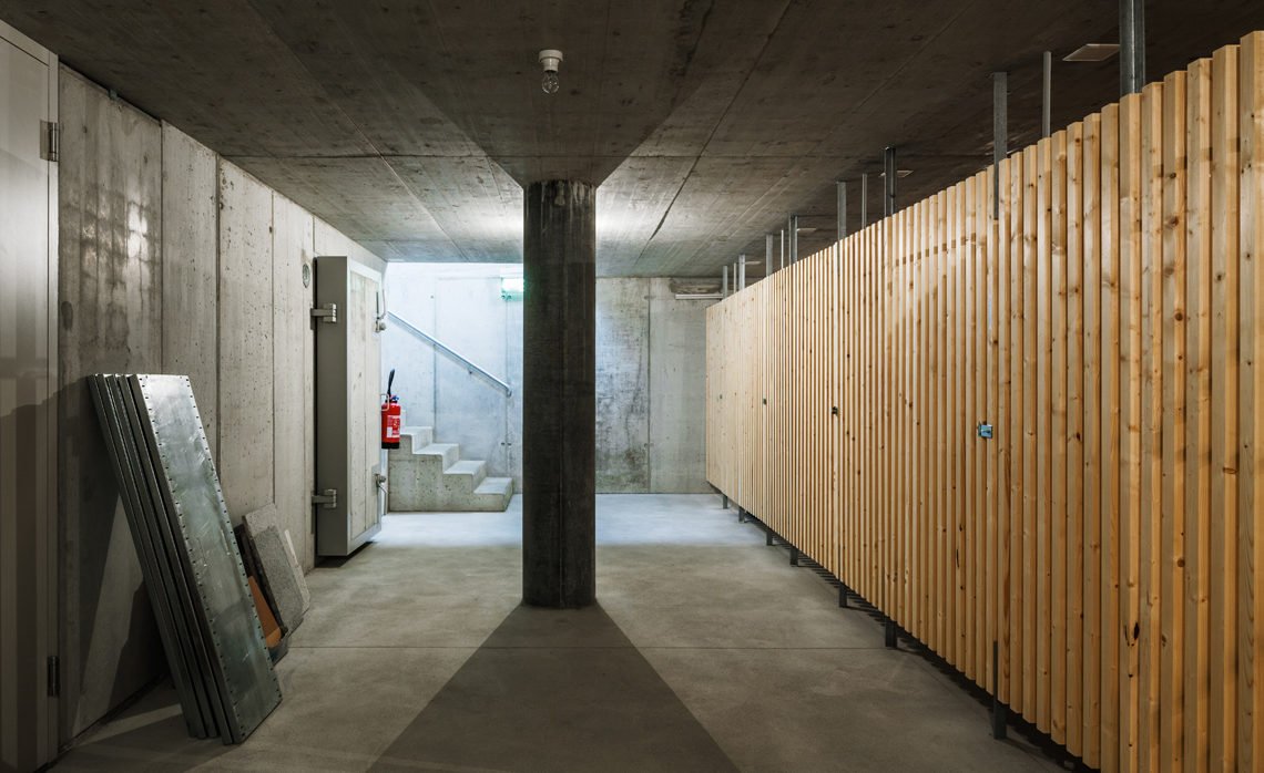
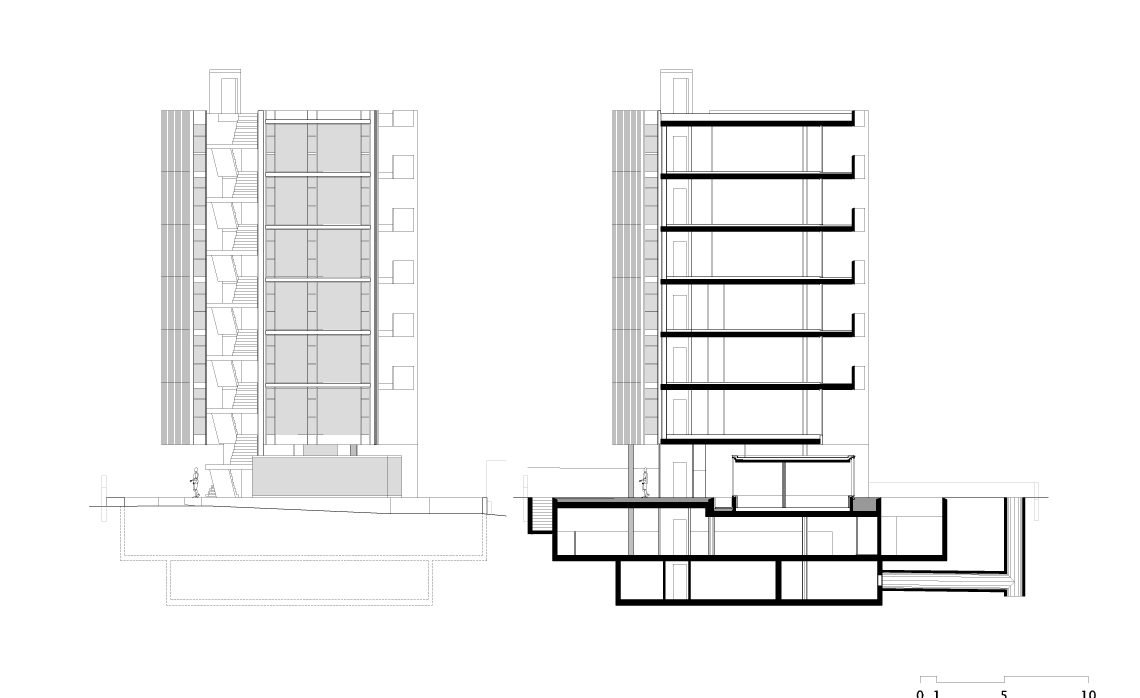
There are two floors underground: the parking garage and the storage.
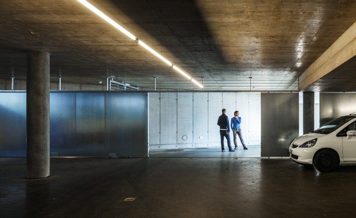
The parking garage covers the entire available area, about 650 m2, and it is shallow enough to allow us to keep an historical retaining wall, and its function, at Pico street. This floor is full naturally lit and ventilated, and the access is provided by a gentle ramp, even for walking standards. It results that the ambience at this space is perceived as placed on the surface and not as a typical undergrounded one.
The storage, 250 m2, has an inner perimeter inscribed in the previous floor. The setback from the boundaries avoids the use of both double high retaining walls and excavation on the border.
Low energy
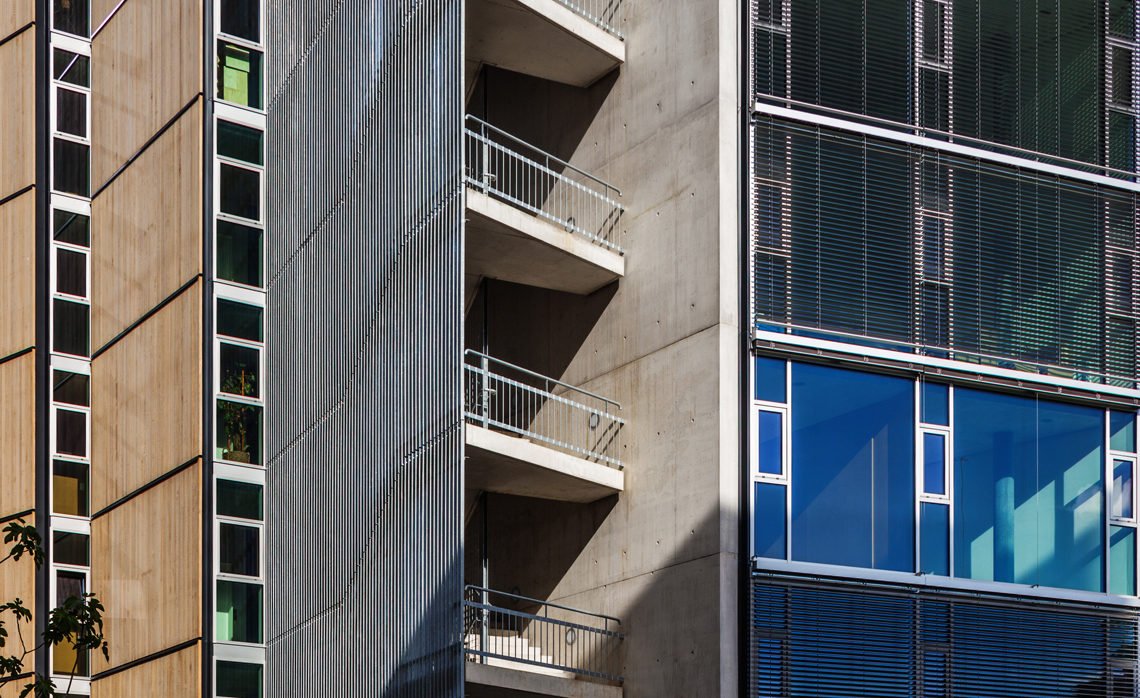
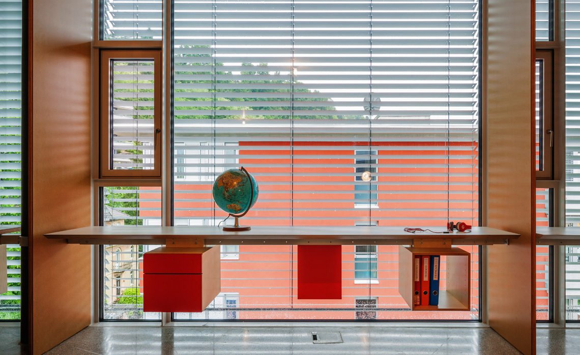
All façade panels were designed following parameters defined by our consultant in order to achieve the best energetic performance. The wood panel outside is ventilated and assembled on a frame which holds successive layers of thermal insulation, vapor barrier and an inside drywall panel. The glazing has triple glass panels on aluminum frame. The south and west glass facades are shaded by a retractable aluminum louver.
Controlled ventilation
Thermal losses are drastically reduced due to a mechanical system of controlled ventilation, independent in each apartment.
Geothermal system
One more strategy adopted to reduce drastically energy consumption for heating and cooling is the geothermal system. Four geothermal probes go down 225 m into vertical loops.
All these issues aim a low energy building and allow to achieve the Swiss standard for energy consumption, the Minergie.
PUBLICAÇÕES:
Periódicos
EDIFÍCIO DE APARTAMENTO LUGANO, SUÍÇA
monolito / brasil janeiro de 2011
EDIFICIO EM CASSARATE – LUGANO, SUIZA
arq / chile n 78, 2011
SPBR ARQUITETOS – CASA PICO
ga document / japão n 121, 2012
WOHNCOUTURE (HOUSING COUTURE)
werk, bauen + wohnen / suíça n 11, 2013
UN BUCCI AUTÉNTICO PARA SUIZ
arq / argentina n 573, 2013
CASA PICO, LUGANO
archi / suíça n 06, 2013
SOLIDEZ QUE DESMANCHA NO AR
projeto design / brasil n 401, 2013
DISTÂNCIA PEQUENA
au / são paulo n 232, 2013
CASA PICO 2008-2013
monolito / brasil n 18, 2013
CASA PICO JOURNÉES
sai: journées sai de l’architecture et de l’inénierir contemporaines / suíça n 14, 2014
TENTATORAS GEOMETRIA IRREGULARES
summa+ / brasil n 134, 2014
EDIFICIO RESIDENZIALE A LUGANO, SWIZZERA
Domus n.999 / Itália, 2016
KENNETH FRAMPTON: BUCCI IN LUGANO
Domus n.999 / Itália, 2016
UNIFIED CONSTRUCTION – BIENNALE ARCHITETTURA
Aesthetica / York, UK, 2016
